
New and Unimproved
Next article: Firefox and Nutscrape
Previous article: With All My Voice
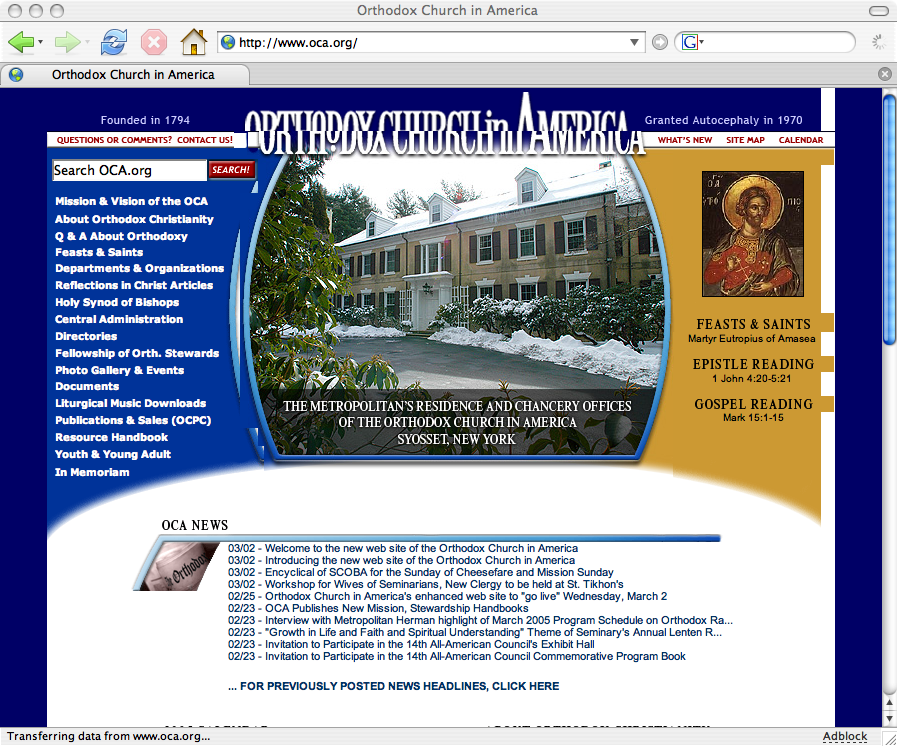 Yesterday, the Orthodox Church in America broke its website. The page displays poorly in Firefox, Mozilla and Netscape, whose shared rendering engine makes up 25% percent of the browser market according to W3 Schools. Old links, such as the link to my home parish’s information and the bookmarklets I use every day, have been broken.
When you redesign a site, your first priority should be that your existing users continue to have a positive user experience. This means creating redirects for moved pages and testing your new design against a wide variety of browsers. A redesign that alienated 25% of your users would get you fired in any corporation that valued its web presence (or at least moved to a position in customer service). I see no reason to be kinder simply because this is a non-profit. In fact, since this is my church, I feel obligated to be forthright.
I will perform a more thorough site critique later, but early impressions are highly unfavorable.
The URL to trackback this post is:
http://kevinbasil.com/2005/03/03/new-and-unimproved/trackback/
3 Responses to “New and Unimproved”
Copyright © 2002–2011 Kevin Robert (Basil) Fritts, all rights reserved.
March 3rd, 2005 at 11:19 am
I’m not seeing the strange header problem shown in your screen shot unless I set a minimum font size or increase the text font size. That the website requires a particular font size to be properly displayed shows that besides being broken, it is also inaccessible.
I’m looking forward to your critque. I’m too frustrated by the many evident design problems to write one now.
March 4th, 2005 at 1:05 pm
Apparently, Mozilla Firefox on Macintosh platforms displays incorrectly at normal text size because the OCA website specifies font sizes in pixels. If the user makes the text size one smaller (View>Text Size>Decrease in the menus, or ⌘-), the site looks fine. Any other text size, borkage.
March 7th, 2005 at 5:52 pm
Oh no, let’s call the metropolitan!